URBAN OUTFITTERS
For nearly eleven years I worked at Urban Outfitters as a design director, under Rachel Robertson (CD), Kevin Lyons (CD) and Sue Otto (CCO), shaping the global brand identity via retail interiors, fixtures and displays.
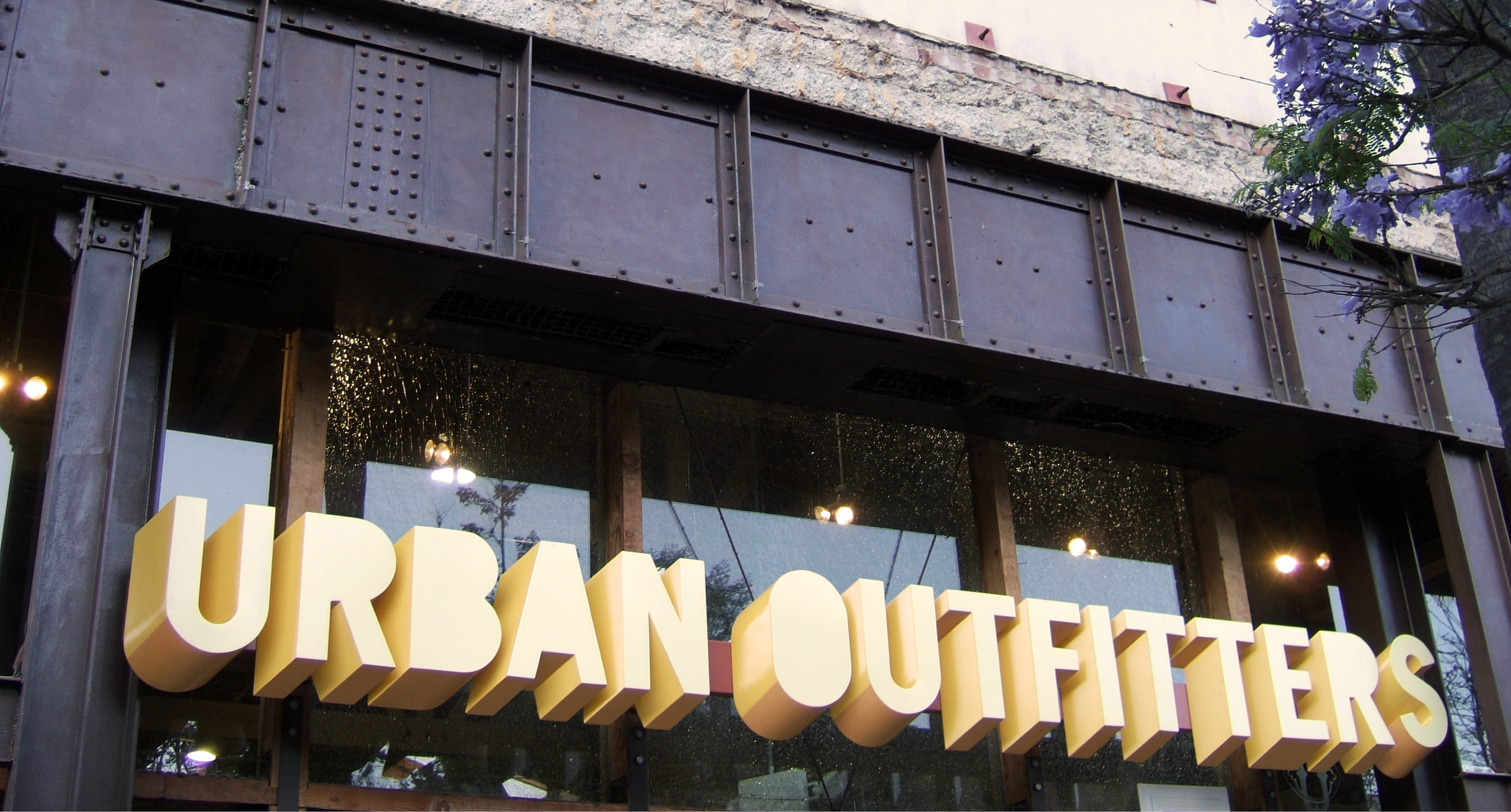
Urban Outfitters embraced dynamic branding with no official logo or typeface, no advertising, and thrived in a constant state of flux; each store underwent three complete changeovers annually: spring, back to school, and holiday.
The identity found its expression not only in the overall environments but also in the specific materials used to build the spaces, fixtures, and displays.
Physical spaces
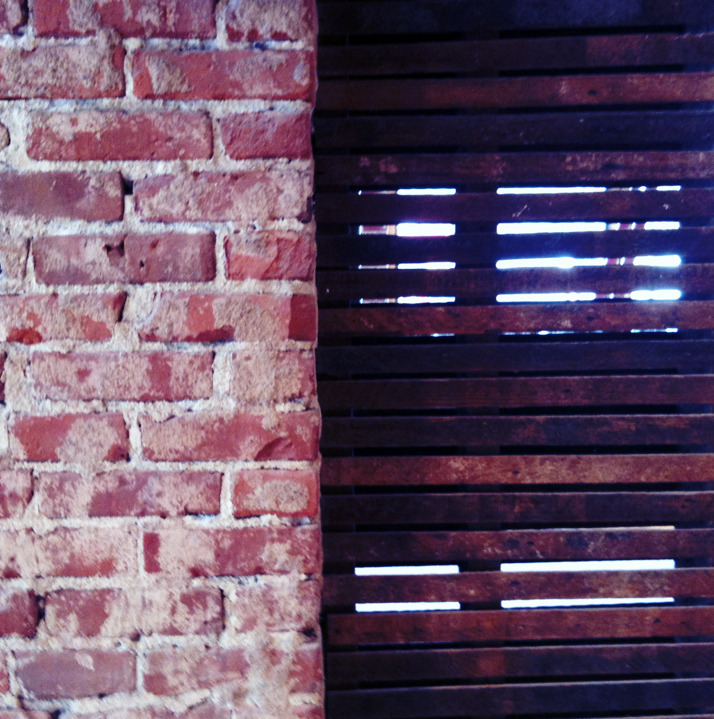
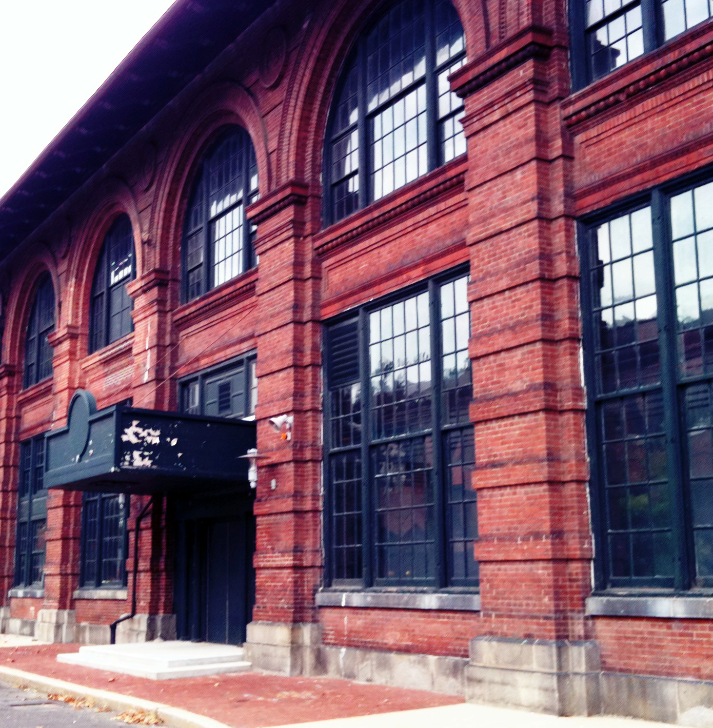
Initially, UO stores were generally occupied pre-existing buildings within communities - theatres (Charleston, Los Angeles), banks (Northampton), and watch factories (Pasadena) etc - that possessed a sense of history or connection to that community. The wear and tear was not only preserved but also embraced, and accentuated.


Signage
With no set corporate typeface or logo, UO freely adapted its typography for signage and window displays to align with evolving fashion seasons.


Displays
The seasonal displays, brand partnerships, music collaborations and pop-up shops were all connected to fashion seasons and we completely reinvented the environments every few months.
We developed the concepts with trends in mind, the relationship to our own identity, the time of year, and regional specificity. This allowed Miami and Chicago stores to feel like one brand while also feeling local and connected to their communities.