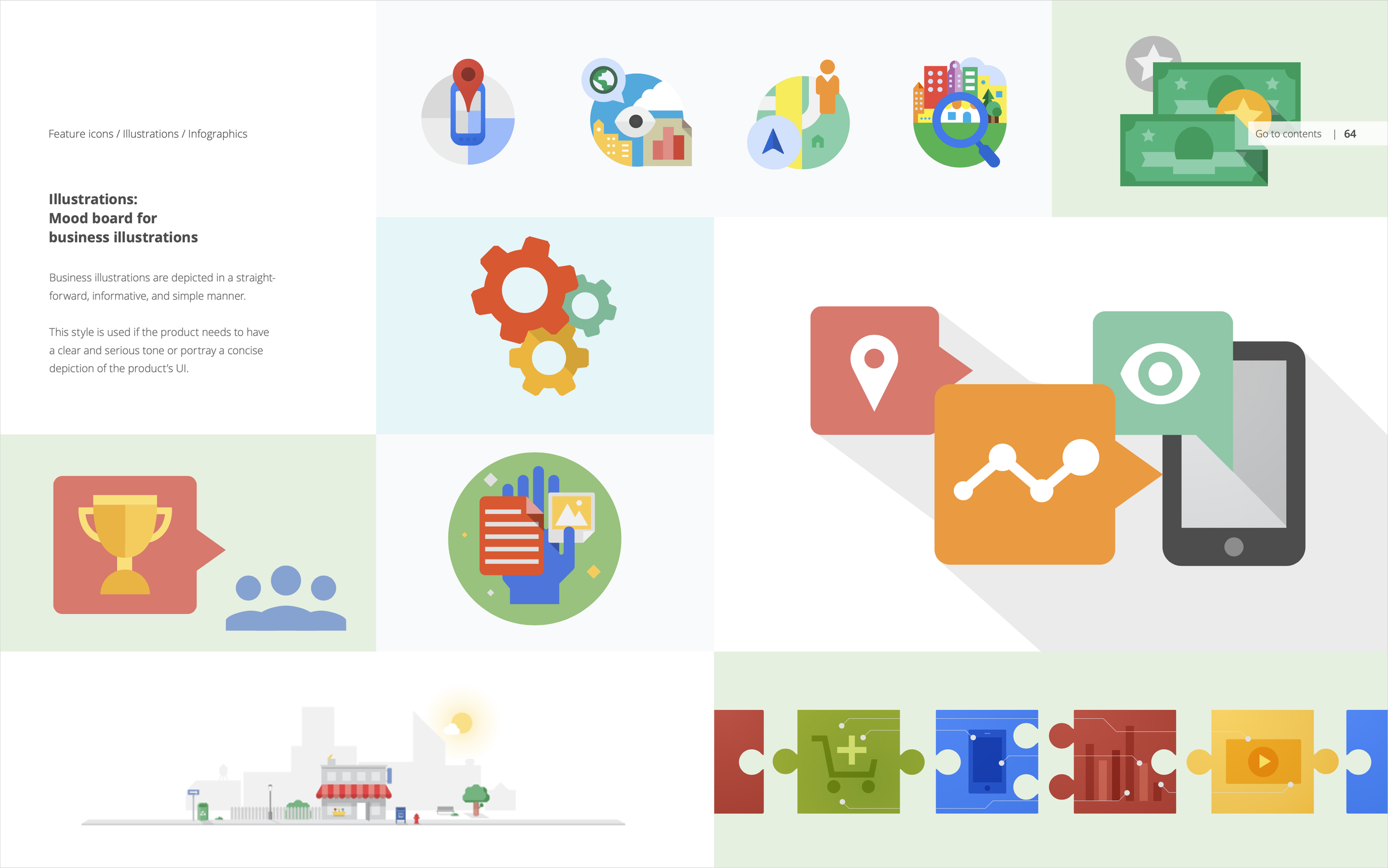
I was recruited to lead a team defining the visual design systems for all of Google properties, this included: logos, logo architecture, iconography, color, and illustration. This initial project was internally named ‘Project Kennedy’ which at the time focused on unifying desktop design. Upon the launch of Kennedy we began work on the next stage of the project, which was unification of mobile and desktop design, called Material Design.
Project Kennedy


Larry Page, Google’s co-founder, tasked designers with creating ‘one beautiful user experience’ and that was the dawn of Project Kennedy.
We began with a competitive analysis of companies like Microsoft and Apple, as well as archiving Google’s design history. At the time, skeuomorphism was prevalent in the industry, so we looked at how to differentiate ourselves and define our own approach.
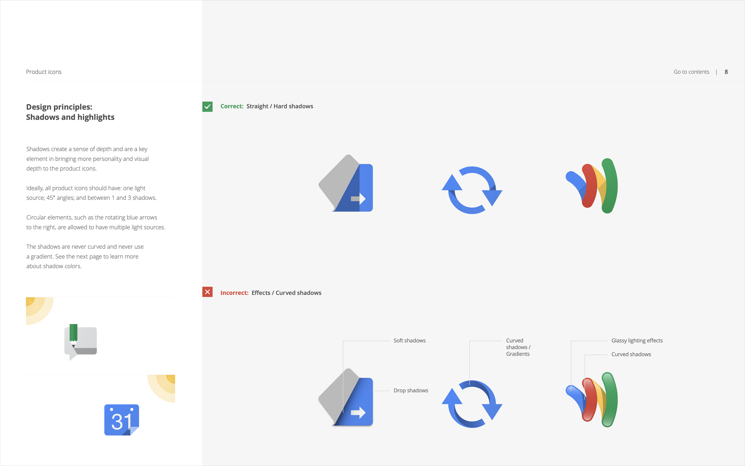
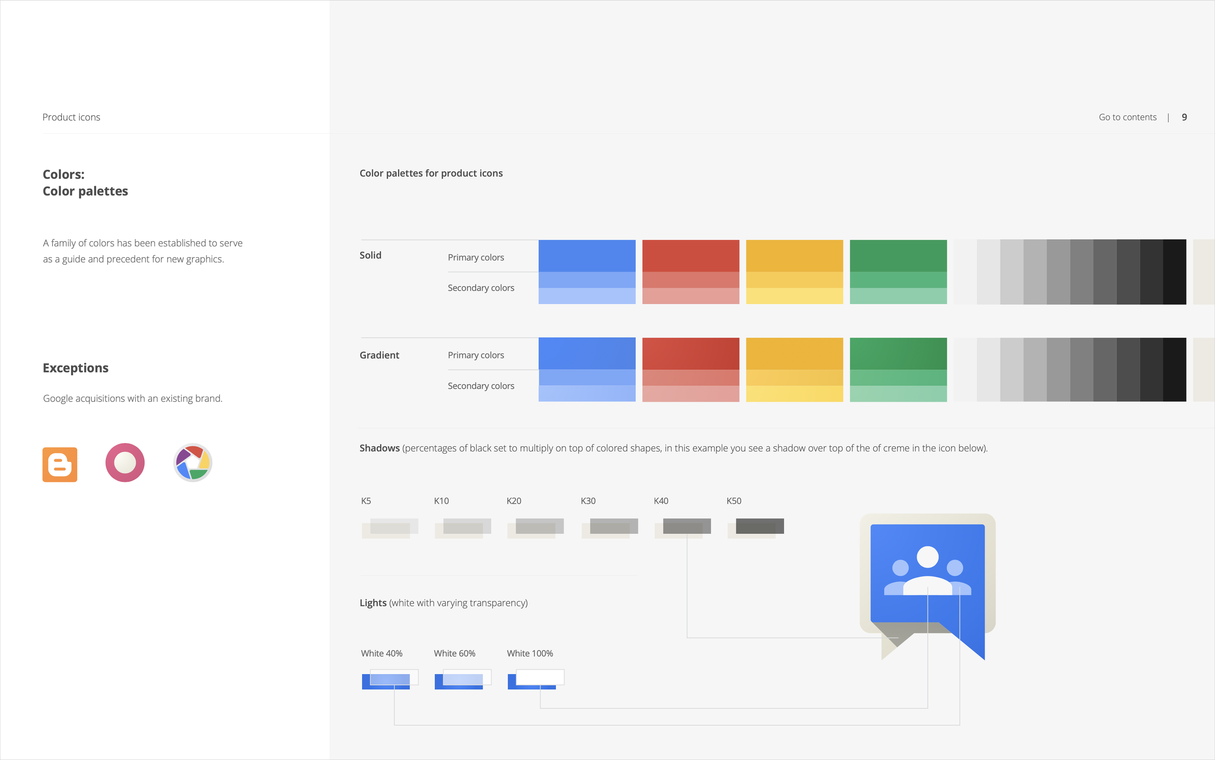
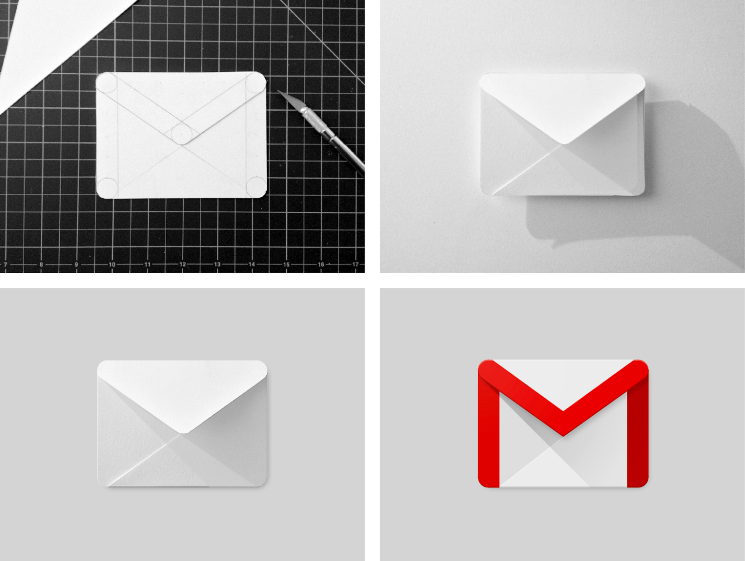
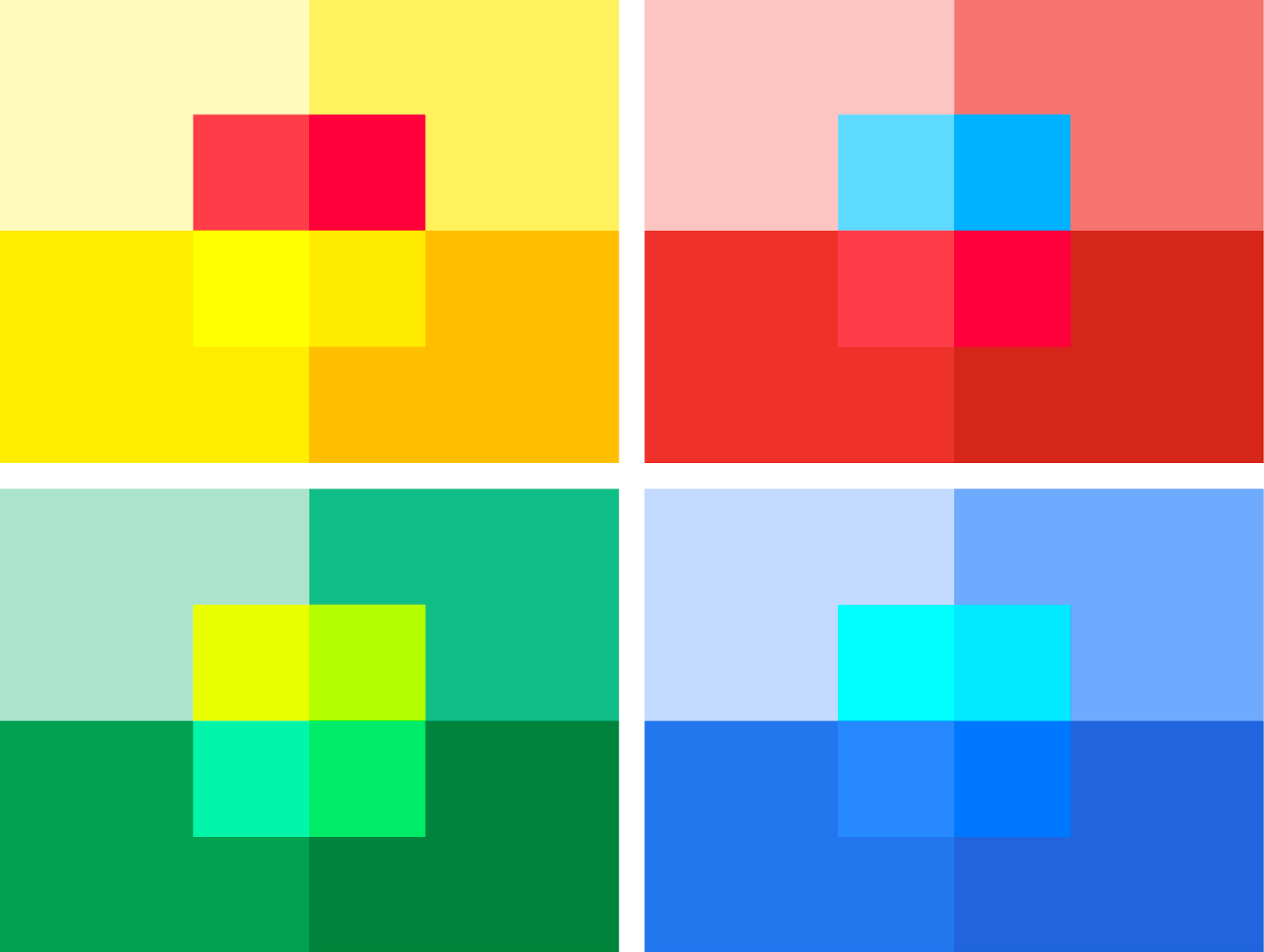
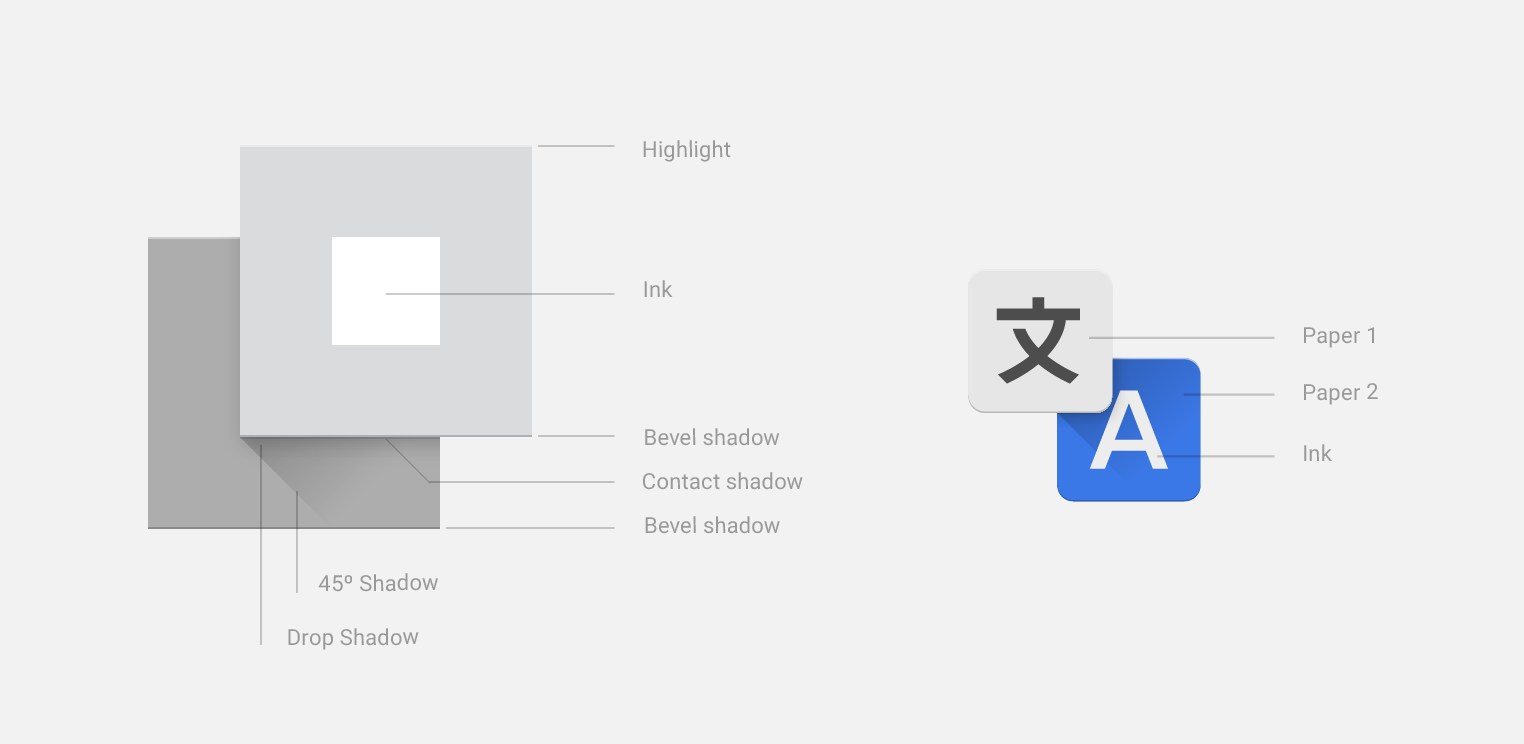
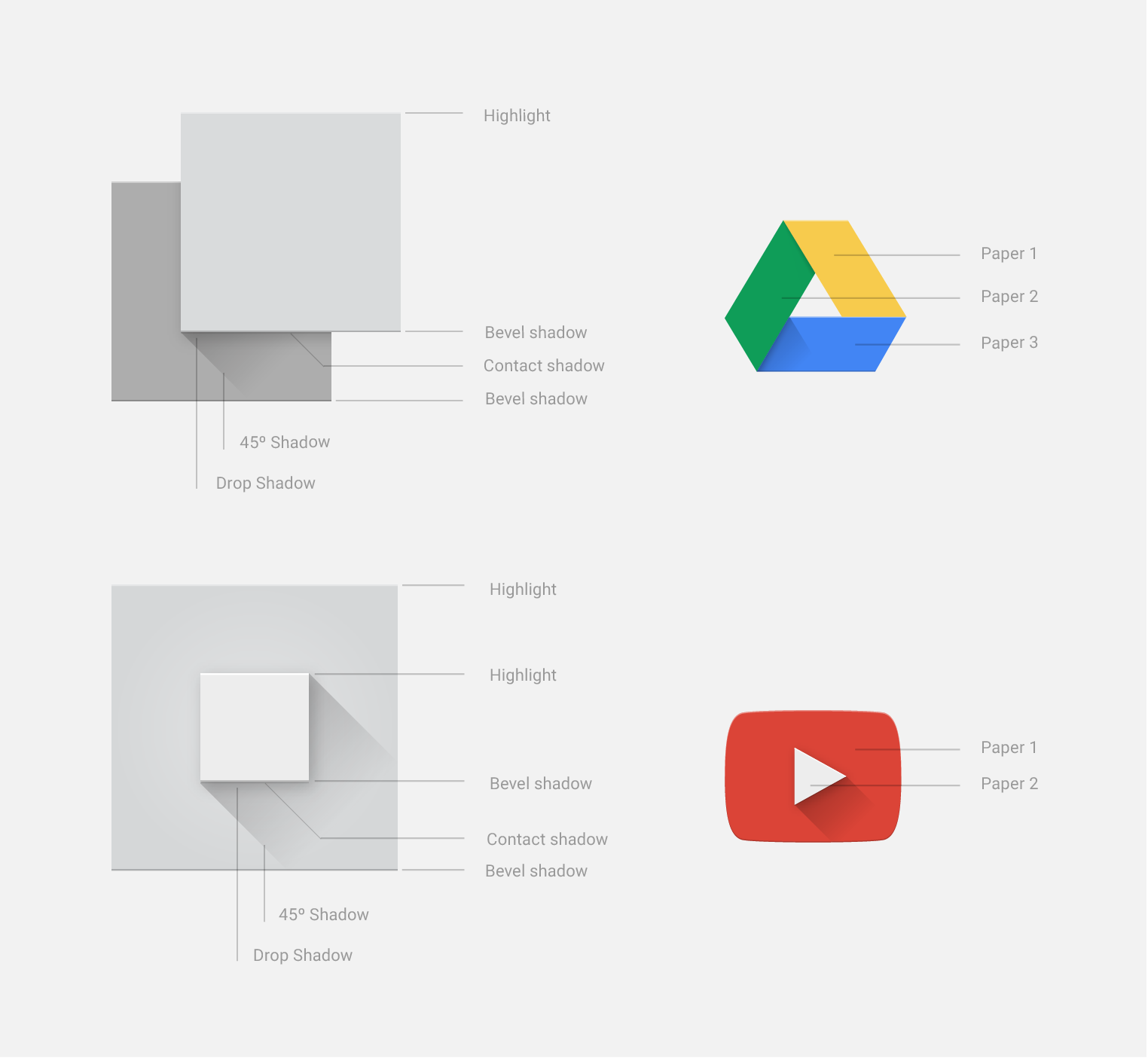
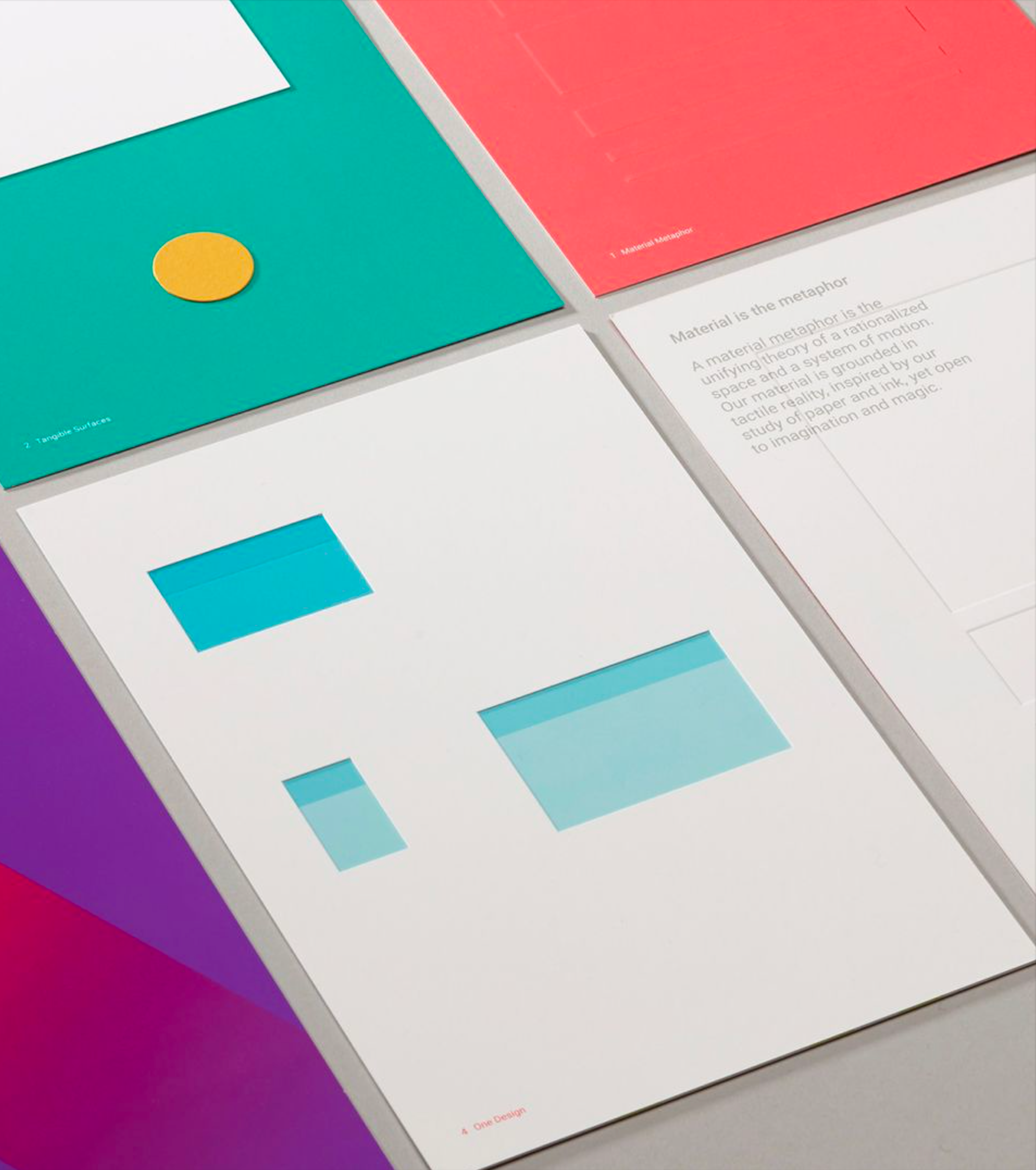
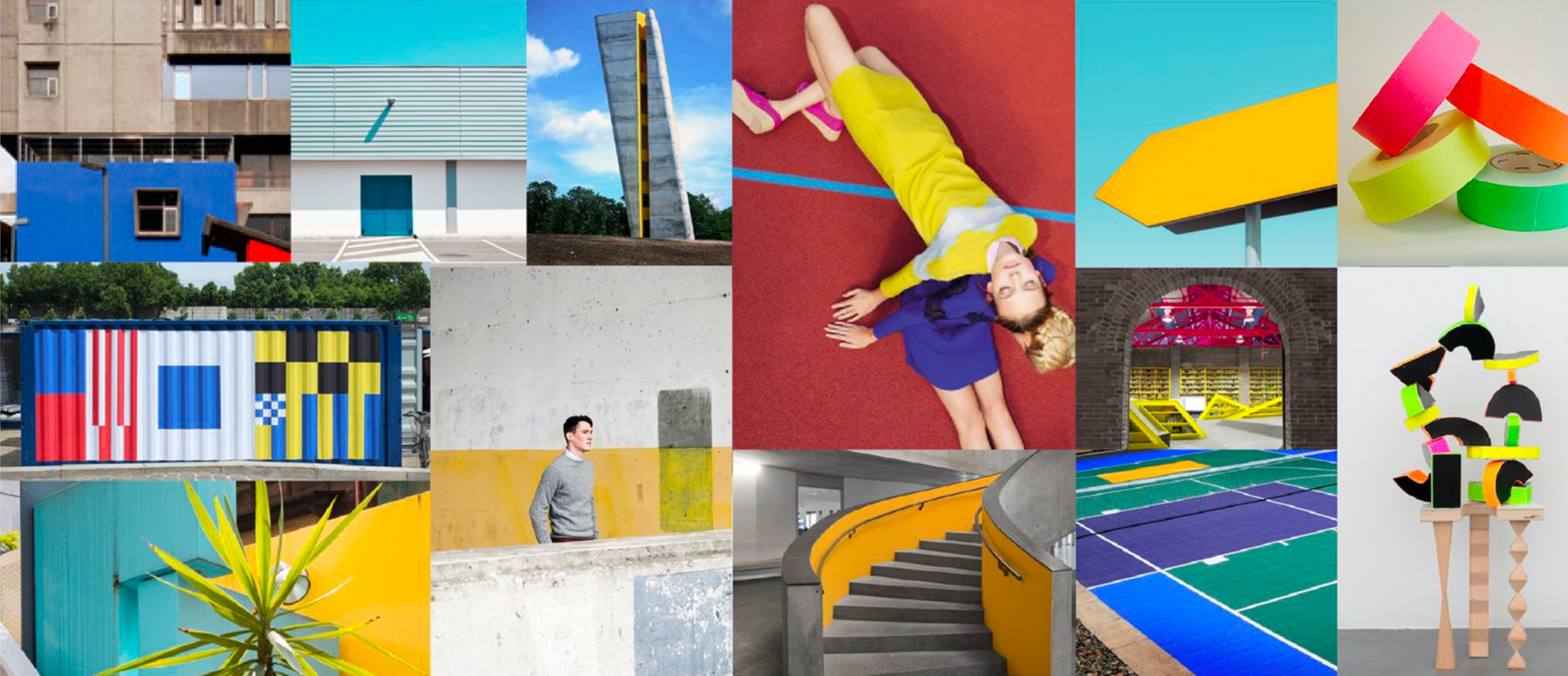
Since Google’s largest products were all digital versions of physical items—such as maps, email, and spreadsheets—we started with paper. Looking at bright, clean, colorful construction paper, crisp cuts, and the shadows created by layering were our design inspiration.

At the core of this Google refresh were simplification and unification. Design and user experience have been streamlined to focus on the fundamentals, stripping back the excess to minimize and modernize.
This palette of bold colors and crisp cuts restricts ornamentation and fosters our simplified approach. Though uniformly flat on the surface, there were subtle shadows and shifts in tone.
This approach to design allowed us to delineate ourselves from our competitors and begin to establish Google design more broadly beyond app icon design.
Visual Asset Guidelines
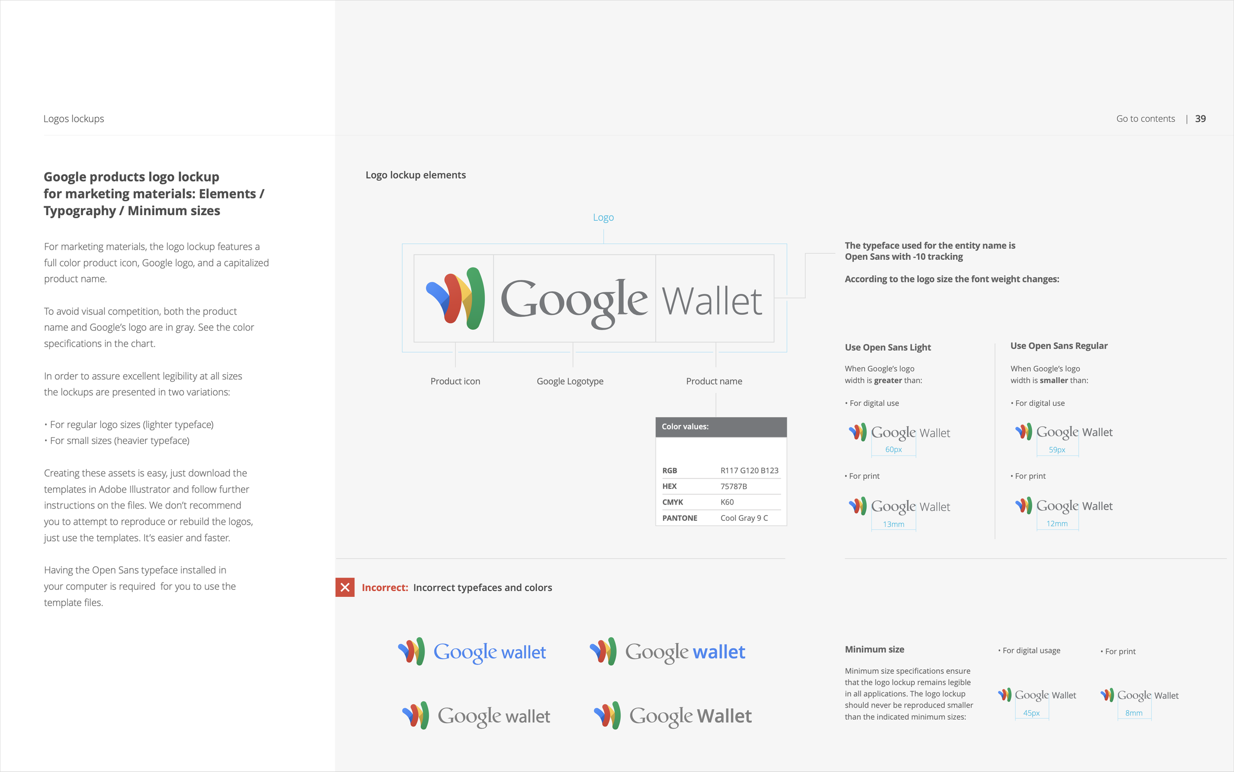
Below are sample pages from the 72-page "Project Kennedy" guideline created by my team, the first comprehensive design guideline for Google. This shows the thinking described above applied to logos, logo architecture, iconography, color, and imagery.
The complete guideline can be downloaded for free as a PDF.


The Google Logo
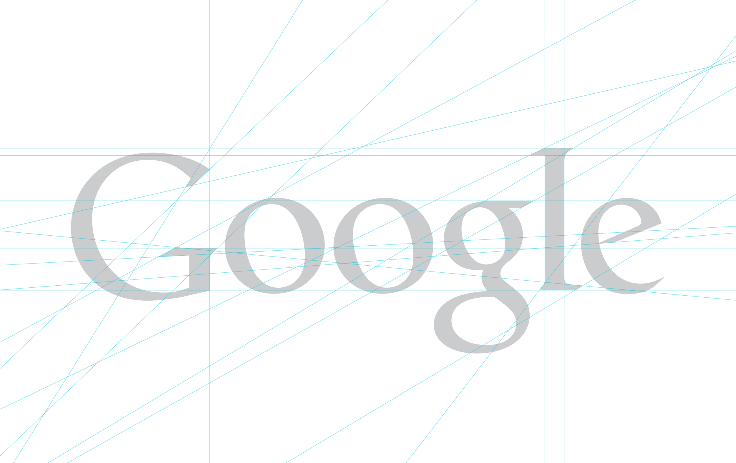
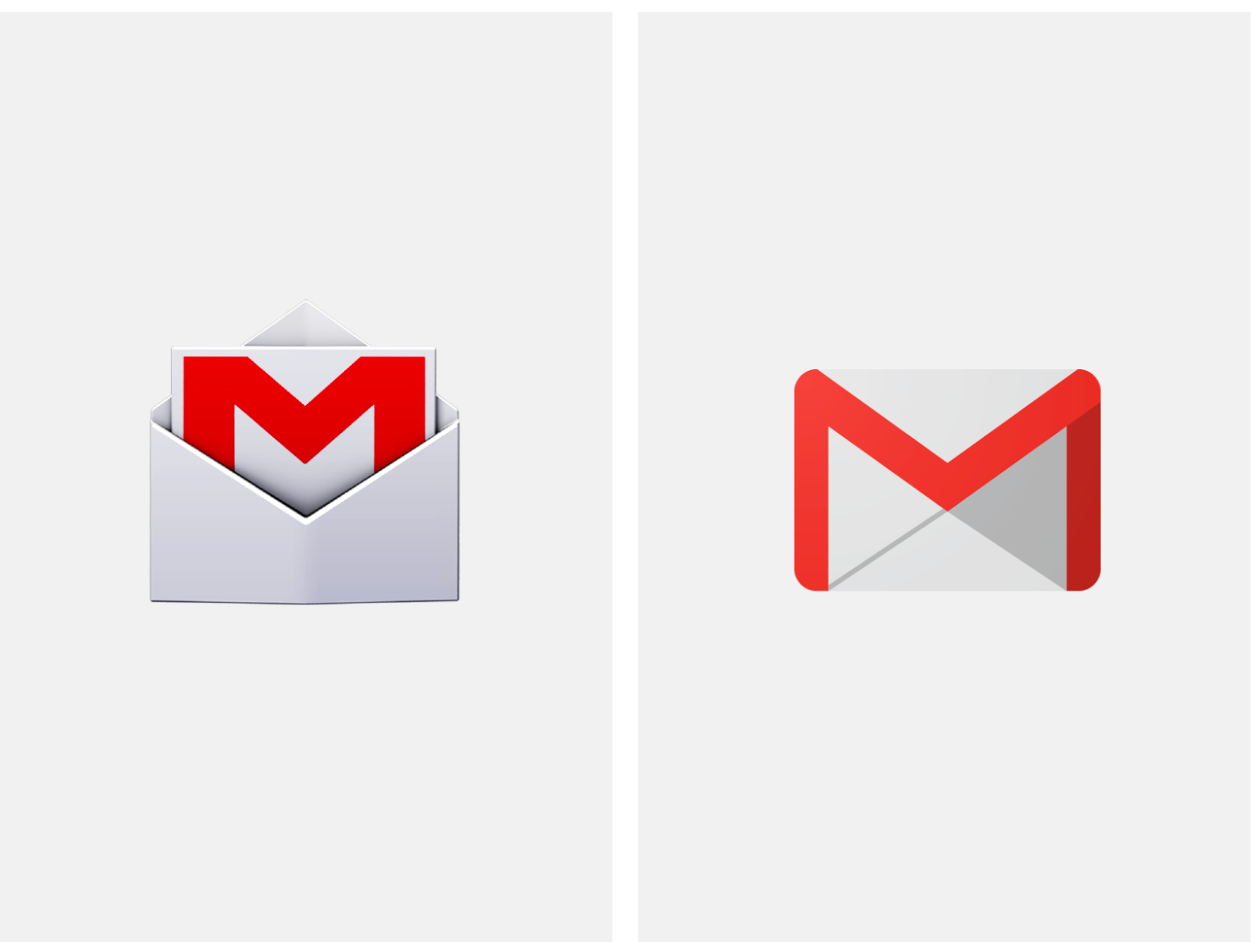
With the redesign of all of our iconography and imagery, the next step was to examine the Google logo itself.
Aside from the drop shadow, which no longer matched the new design style, we noticed several issues: there were over 10 different angles, the serifs had irregular curves, the ‘e’ dipped below the ‘o,’ and the ‘G’ and ‘e’ also contained irregular curves.
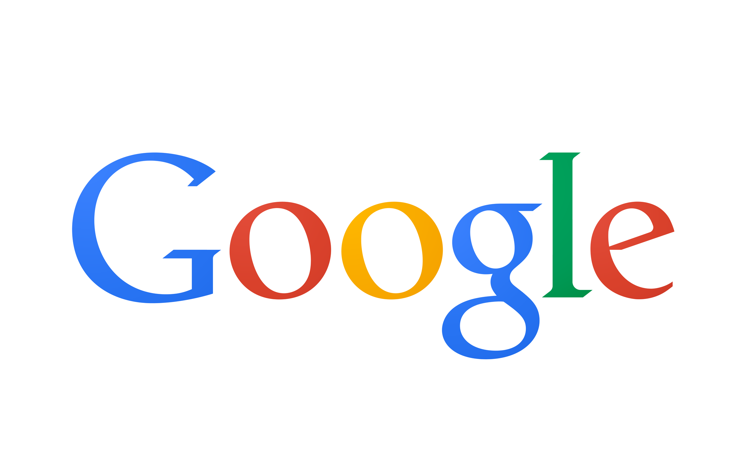
Here is the cleaned-up logo with 2 angles, corrected curves in serifs, letters, and readjusted letter balance.
Material Design
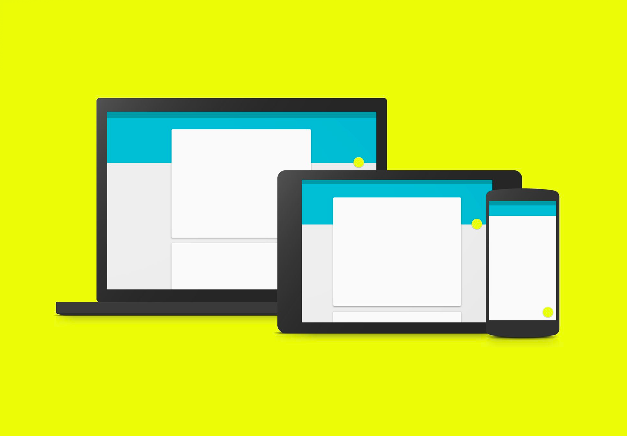
With the success of ‘Project Kennedy’ the push came for broader unification across all platforms.
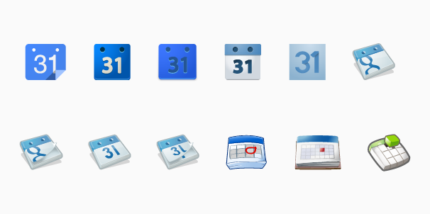
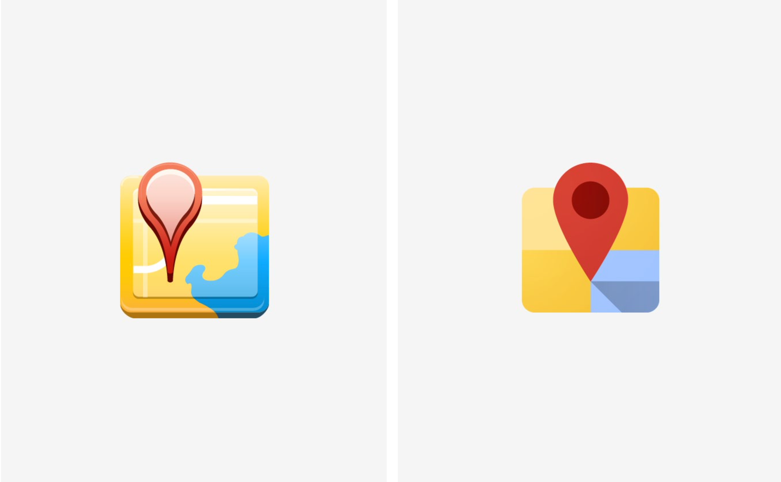
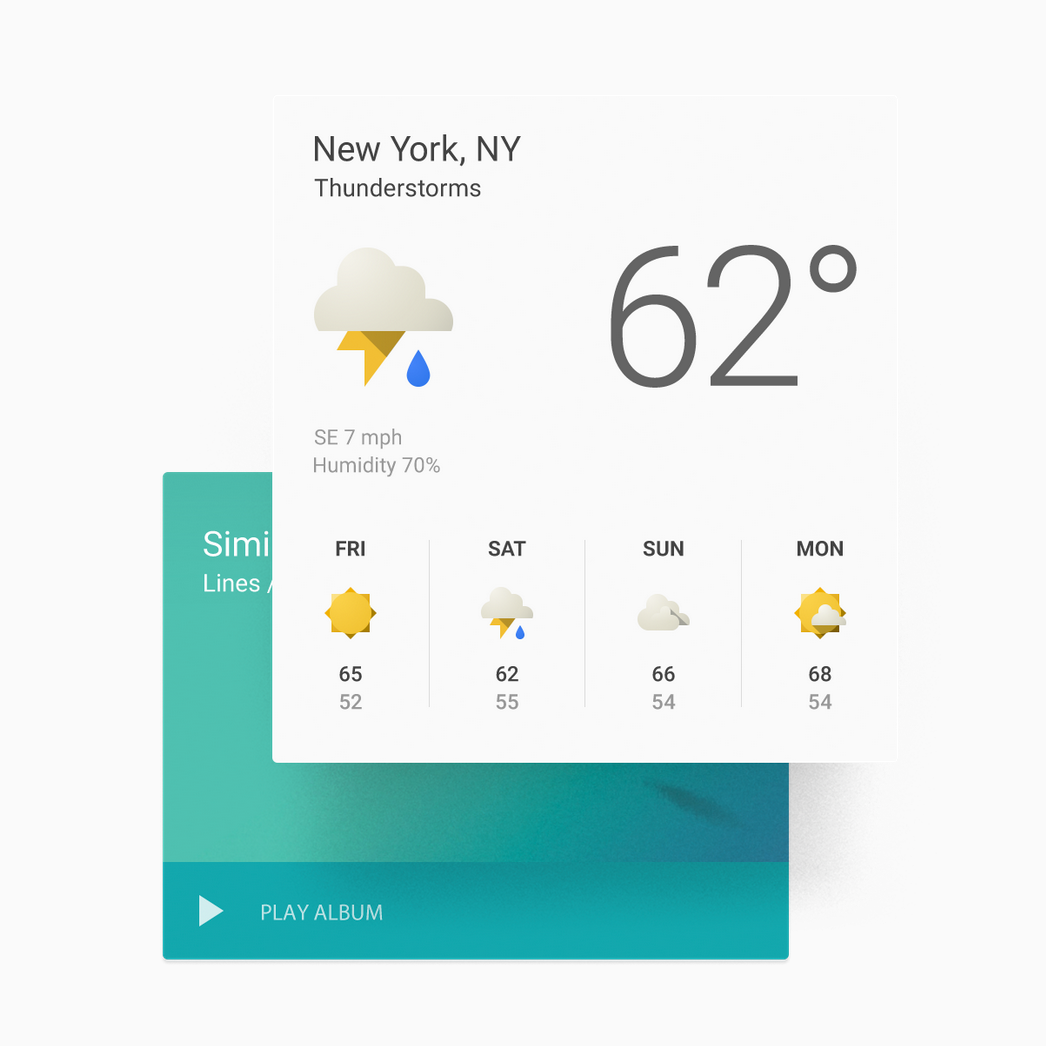
To illustrate an extreme example, below you can see the number of official icons representing Google Calendar via mobile app launcher, desktop, and Chrome extensions. These were all live to the public and led to user confusion about whether the mobile app was connected to the desktop version.
We started with a revision to the paper metaphor, expanding it to include ink (with special properties), more realistic light sources, and dimension.


We looked at simplifying shapes across products, adjusting sizing and visual weights. Bolder, brighter color was adopted with vibrant pairings in identity elements as well as UI.
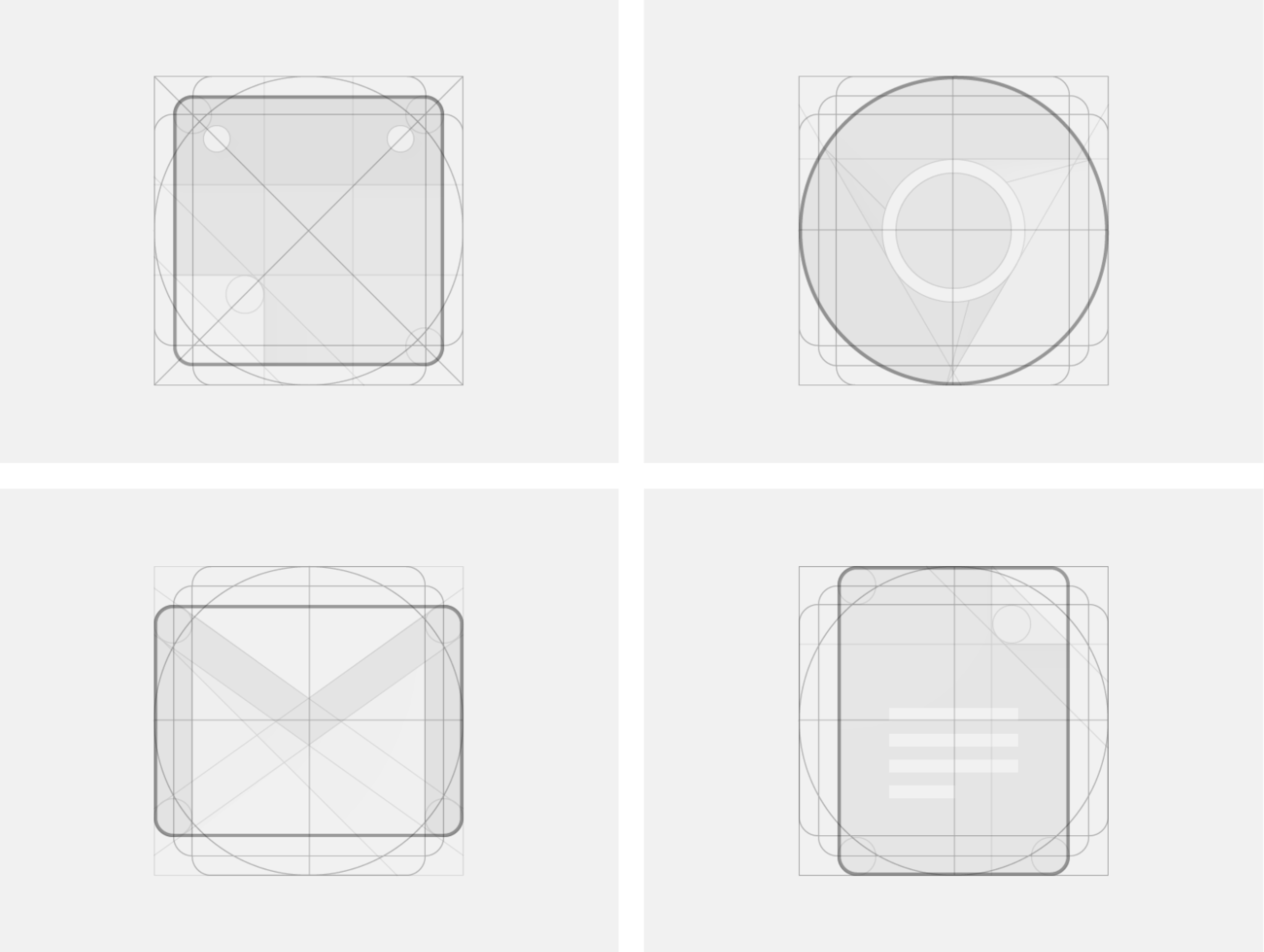
A higher level of detail was applied taking lighting, depth, weight and materials into context.
This approach informed the unification of icons across platforms, such as consolidating the previous Android app icon and desktop ("Kennedy") icon into the single Material Design icon shown below.

The design philosophy was applied to UI/UX to articulate Google Design in all our product experiences, culminating in shared and reused design components and code.


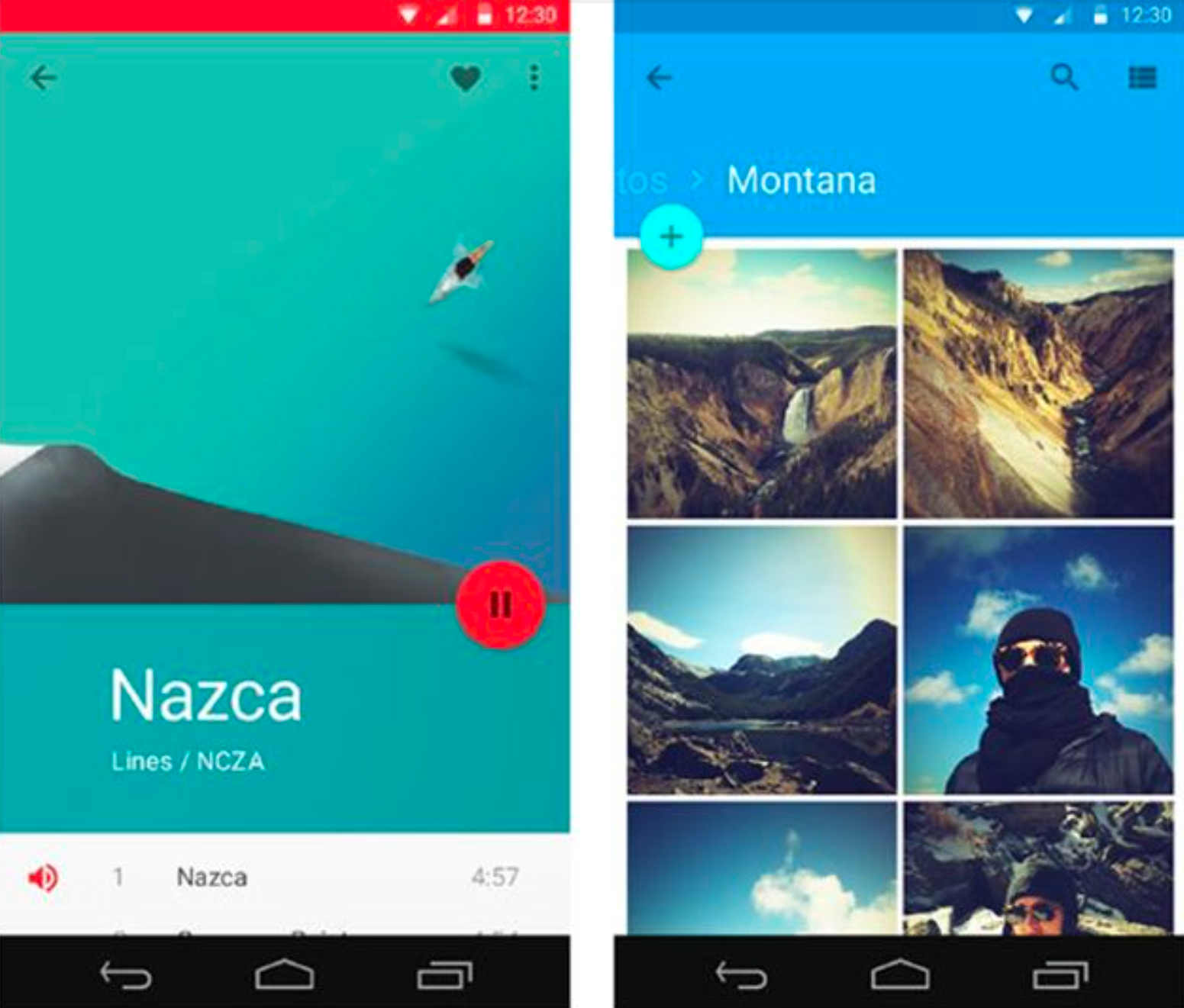
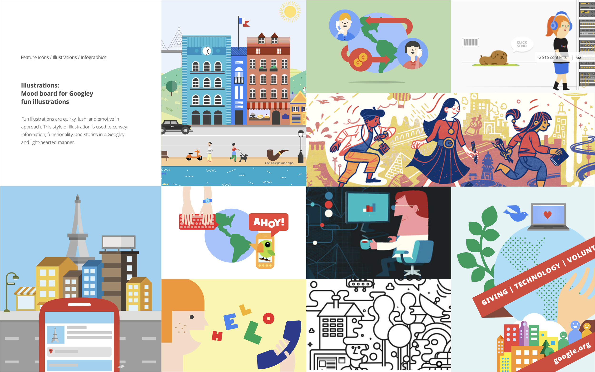
Color was expanded and applied beyond app design to photography and illustration.


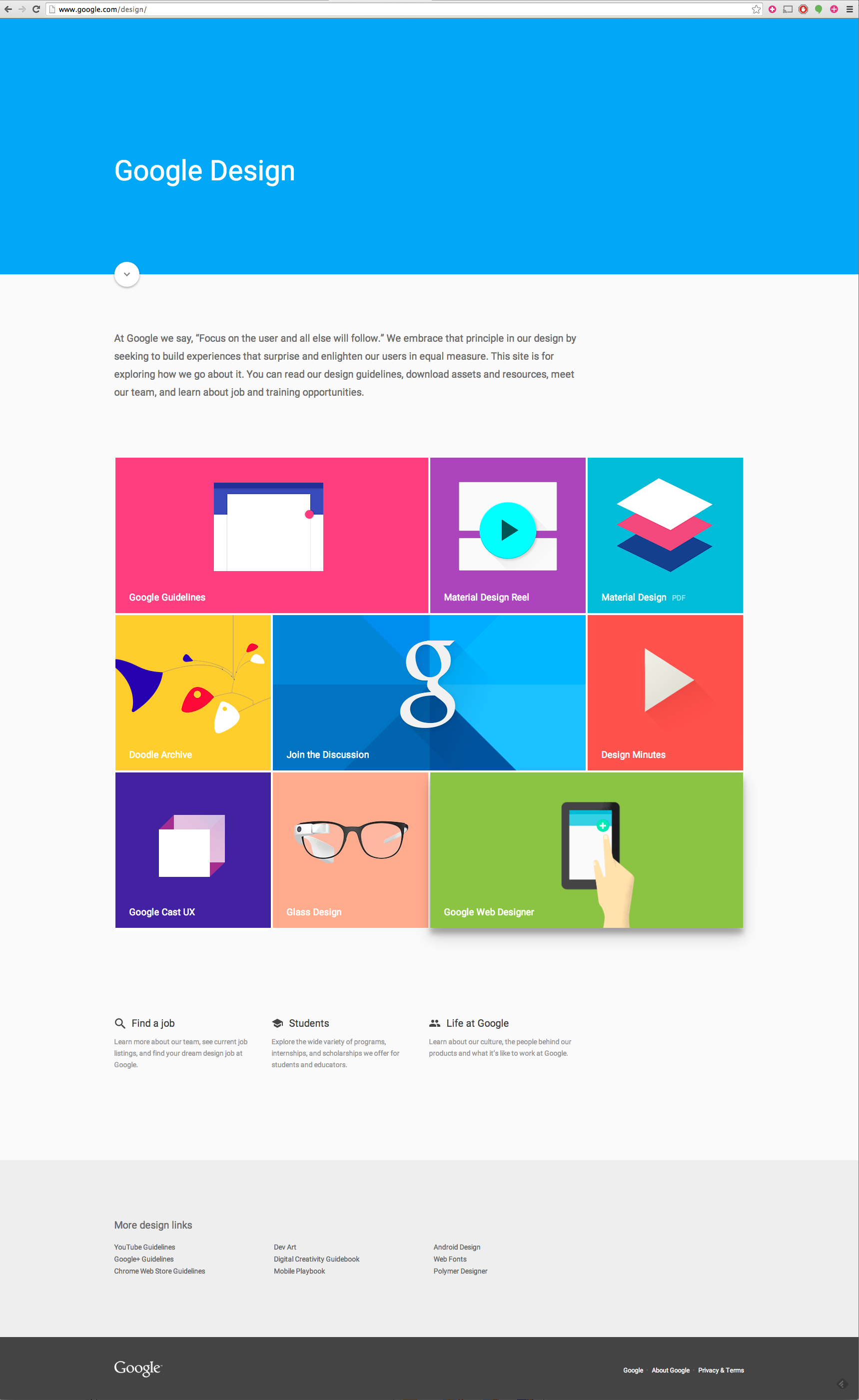
All this work culminated in the publication of design.google, where the public could access all our specs as well as other design-related content, such as project case studies, articles, talks, and information about careers at the company.