YOUTUBE IDENTITY
From 2014 until 2026 I was a creative director focused on design systems, identity design and cultural moments across all YouTube products. In 2017 I designed and led the role out of the YouTube Logo. My team designed and patented the elements and specs for: the YouTube logo, logo architecture, typefaces, iconography, color theory, imagery (illustration, photography, animation, video etc), motion design, and UI/UX. My team functioned as an internal agency and was staffed with graphic designers, interaction designers, animators, illustrators, art directors, UX engineers and a copywriter. When we needed to scale to tackle projects we partnered with Saffron Brand Consultants and Both&Yes.
The Logo
The new YouTube logo was launched on August 27, 2017 and was created to address changes in our business, the expansion into a multiple YouTube apps, the addition of subscription services, growing B2B offerings and our community programs.
YouTube Logo Sans was designed to continue the tonality of the original logo, but was optimized for screens and legibility at small sizes.
While examining the icon, we noticed that it wasn’t quite symmetrical or balanced, so that was addressed with the updated type to build a clearer and better-balanced mark.
My team created the sonic branding and new logo animation system in 2022 and you can read more about it on the YouTube Blog.
Philosophy

Before we could begin designing an expansion of YouTube’s identity, we needed to establish a design philosophy grounded in our mission and business goals that would unite all product and marketing teams.

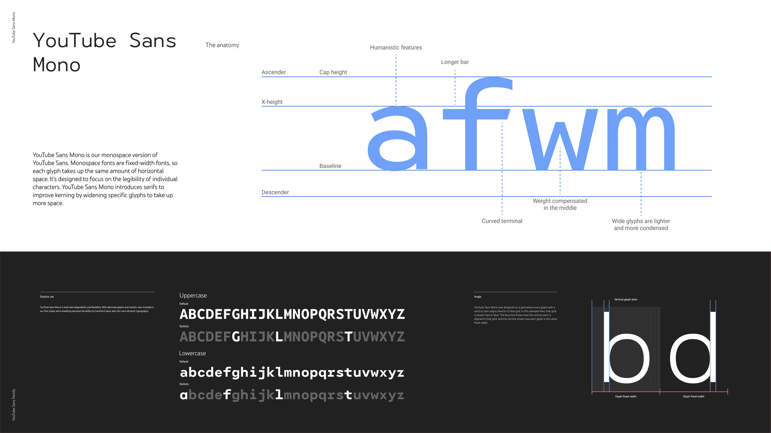
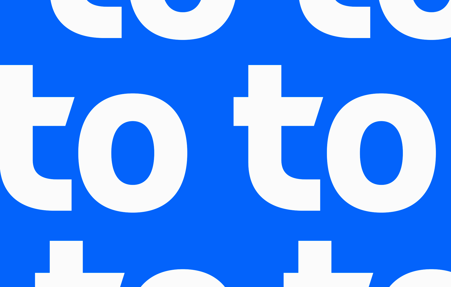
YouTube Sans

YouTube Sans is our proprietary display typeface used throughout our products and marketing. Its design reflects the communities that call YouTube home, and you can read an article I wrote about its creation here. (Assuming "here" links to the article)
Beyond its huge personality, it also features alternate glyphs and stylistic sets. It is a variable font with rounded, monospace, and italic versions. Additionally, we built in grades for use in light and dark themes.
YouTube Sans currently covers 219 Latin languages, 90 Cyrillic, 25 Arabic, Hebrew, Korean, Japanese, Thai, Tamil, and Devanagari.

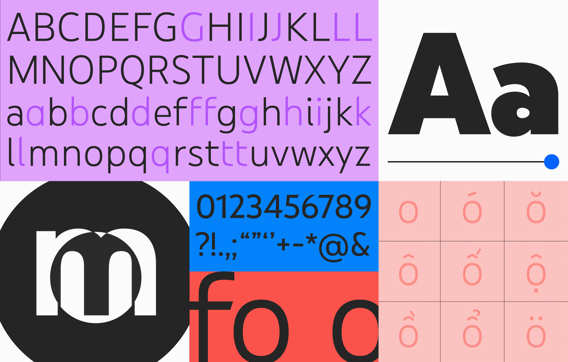


Grades solve the optical illusion that occurs when you transition from black text on white to white text on black. This illusion means that using the same font weight and size makes white text on black appear bolder than black text on white. Using grades solves this optical discrepancy.

We also created contextual alternates which adjust based on the letter that precedes or follows a character.

YouTube Sans overview video

Iconography
YouTube has three distinct tiers of icons within our products that are primarily used as wayfinding: app icons (or app launchers), topic channel icons, and system icons.


This is our set of app icons.
All of our icons are designed on the same grid. Our display typeface, YouTube Sans, also aligns to this grid, as shown above.


The topic channel icons are used in-app and on third-party platforms and identify a themed channel operated by YouTube, either algorithmically or through curation.

System icons are the core navigation within YouTube products, no matter the form factor or app. They have been designed first and foremost with accessibility, app binary size, and light and dark themes in mind. Seen here is a small sampling of our over 1200 system icons.

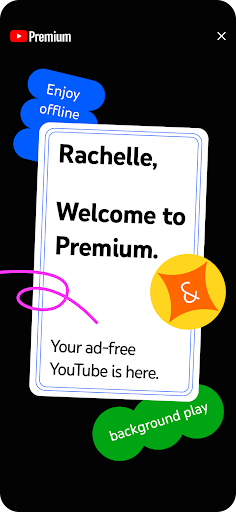
Imagery

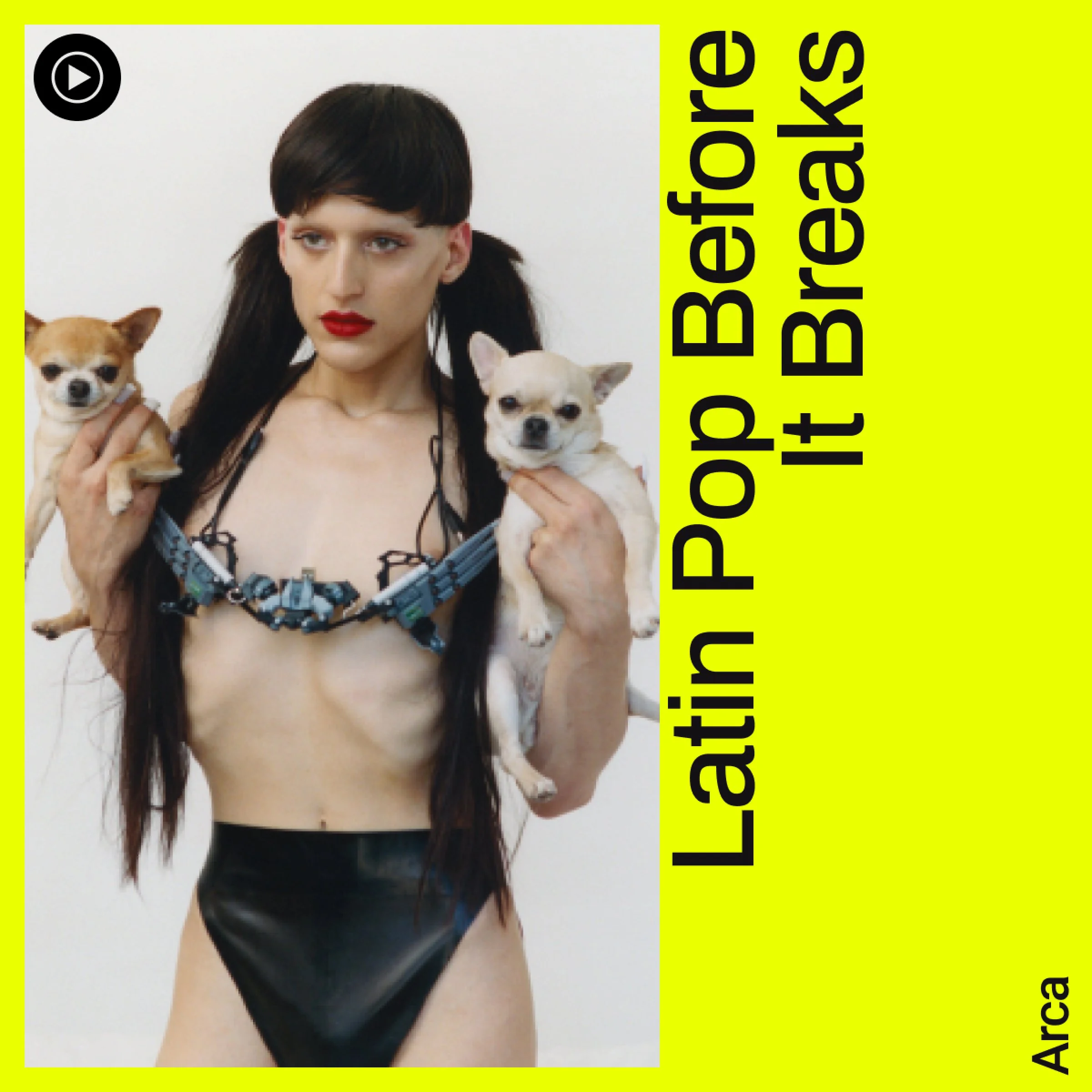
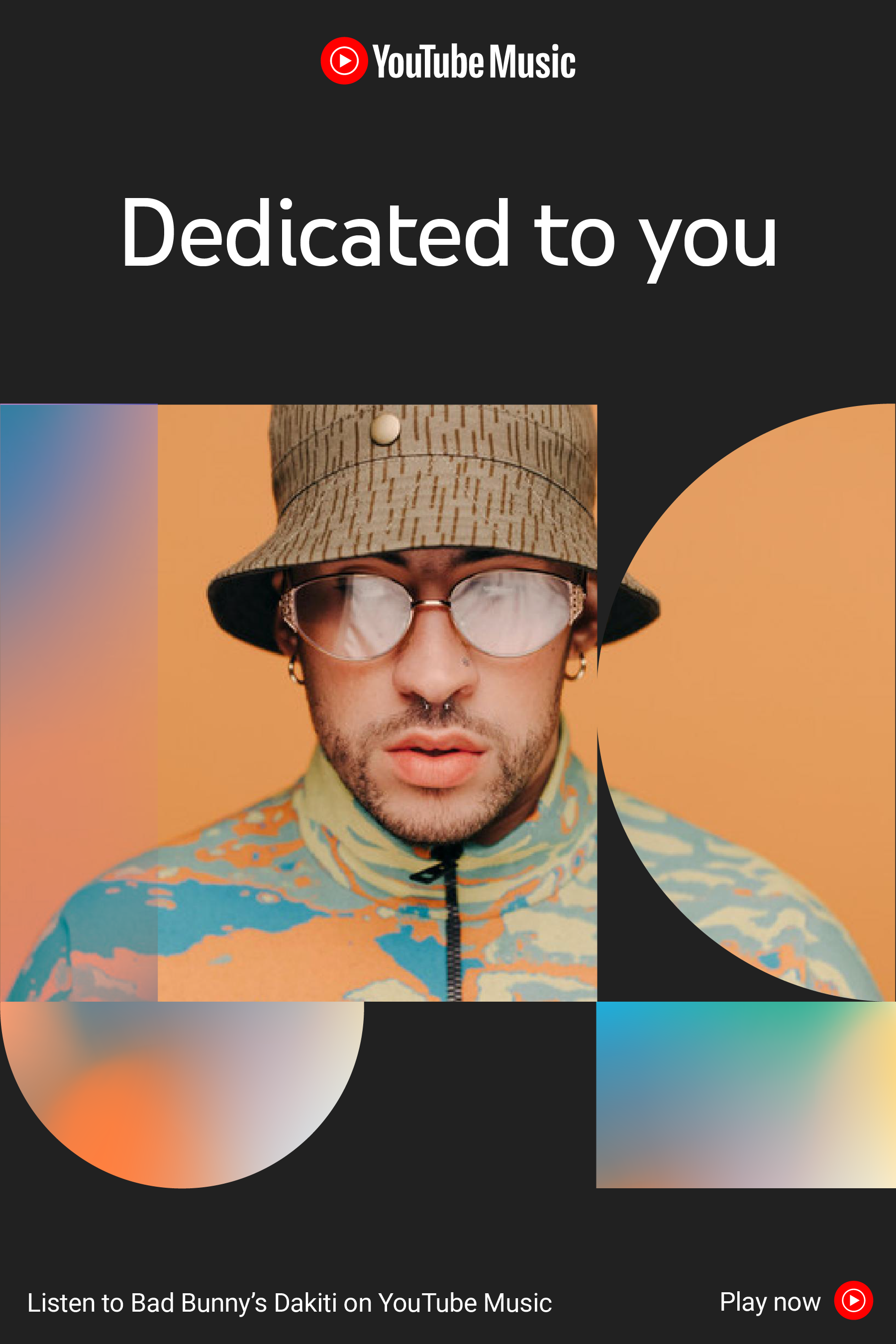
YouTube comes to life with our rich imagery in product and marketing. Here is a sampling of our imagery guidelines which include: illustration, animation, photography, video, pattern, and texture.
Our illustration style changes often to reflect the communities that call YouTube home. We focus on humanity and the visible hand of the artist, avoiding overly vectorized geometric imagery.
Our animation is only used when appropriate in telling a story; we do not animate for the sake of animating


Photography plays a huge role at YouTube, as we want to focus on representing our content creators authentically.
In our guidelines, we cover various aspects, including studio shooting techniques, portraits, objects, environments, night vs. day shots, crowds, moments, color vs. black and white photography, lighting, and inclusivity.
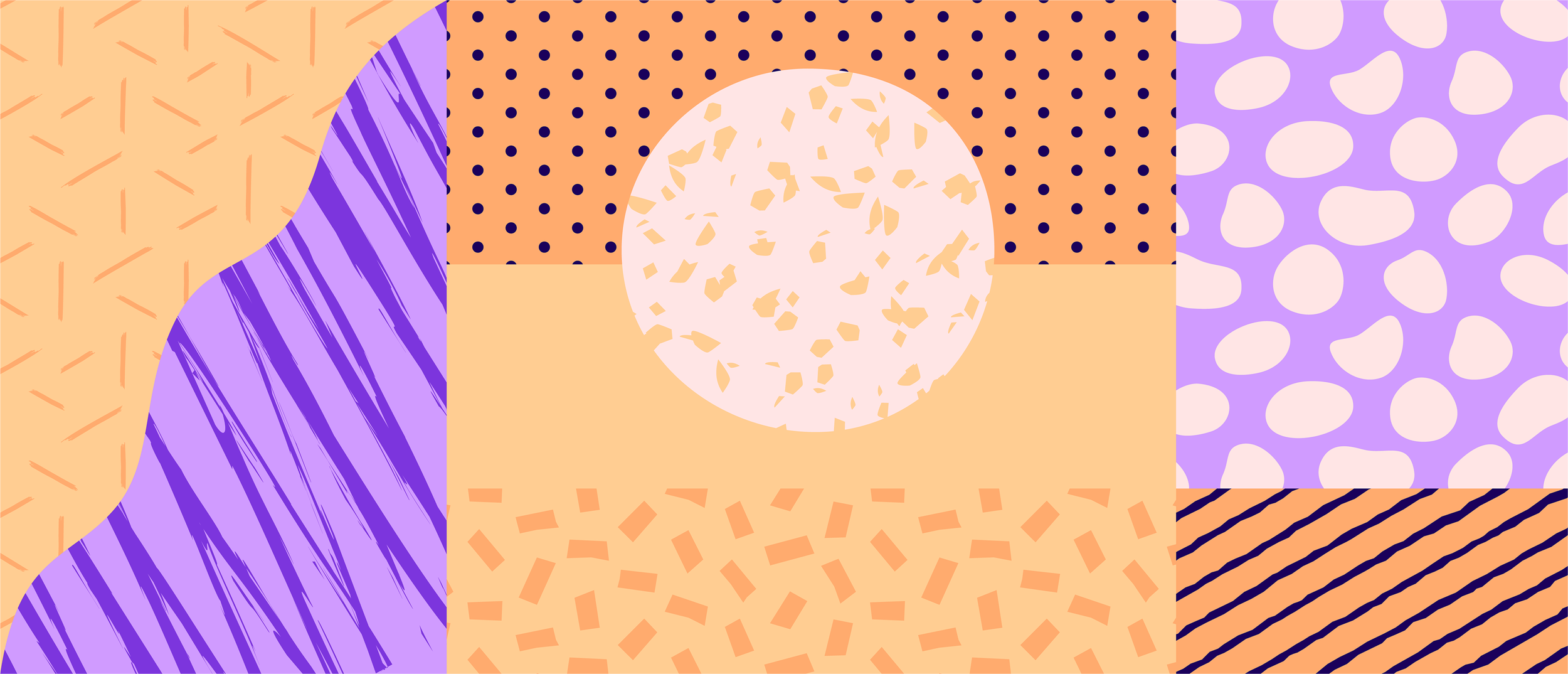
Sometimes imagery isn’t appropriate, or simply isn’t available, so we developed a pattern, texture, and shape library.
We felt patterns could abstractly represent community: one shape can represent an individual, while the grouping of shapes in a pattern signifies the collective community. Patterns coming together represent communities coming together. This allows us to bring YouTube’s personality into places like error states.

Visual Expression
All of the identity elements we’ve designed come together to visually express the brand, and below are examples in product and advertising of some of our work coming to life.


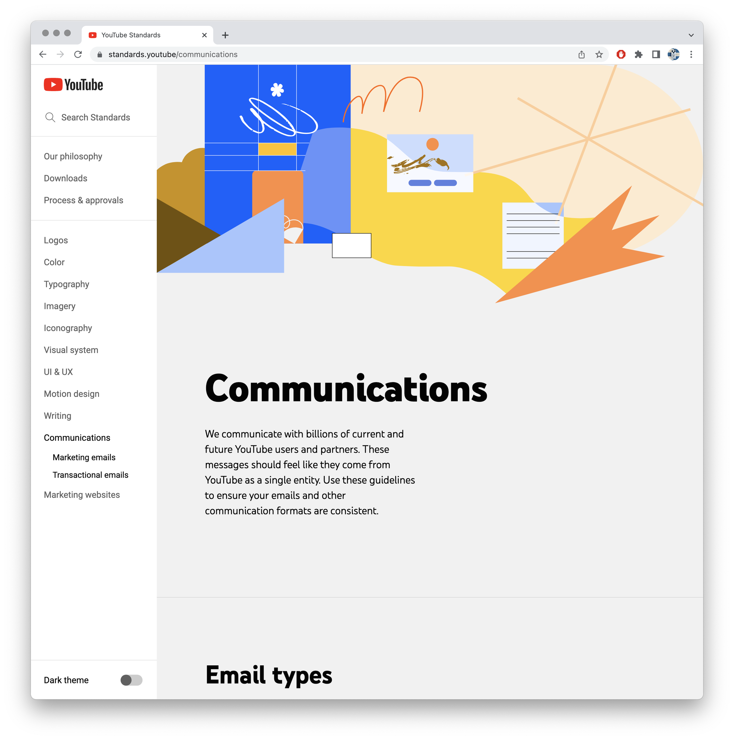
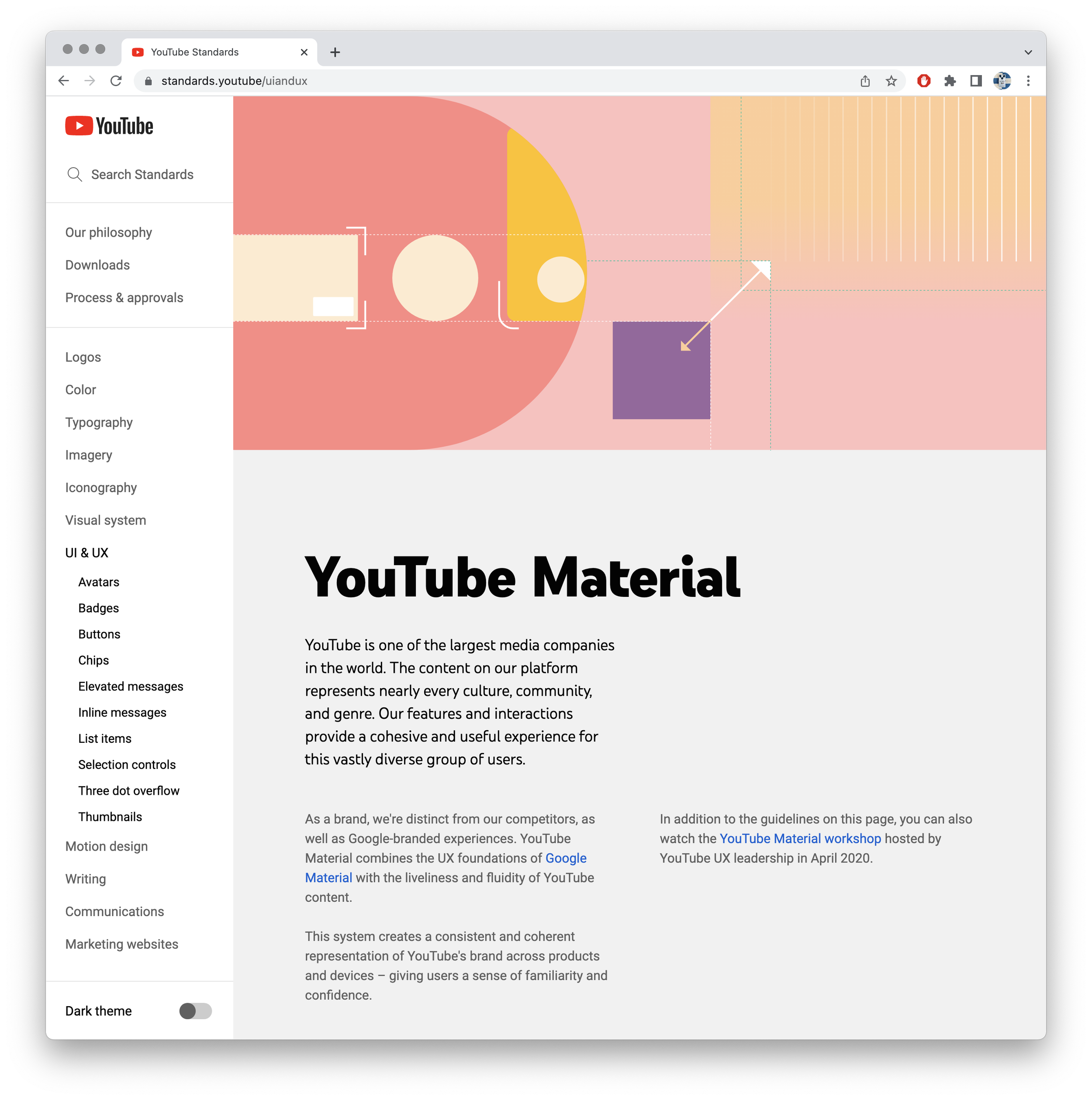
Standards
With all the new design updates to YouTube that my team has implemented, we needed a place to document everything that could be easily shared both internally and externally. We created a completely custom website with dozens of embedded tools, as well as design documentation, best practices, explorations, accessibility, internationalization, and legal information. The site is fully available in light and dark themes, just like our products, so designers and partner agencies can see designs in real time. Below is a sampling of the headline sections.