YOUTUBE
In 2024, I launched an identity update for YouTube with Amy Yip and our team, targeting specific UX components to reinforce and unify our brand. This included an update to the color and typography to the YouTube logo I designed in 2017. You can read more about my team’s process on Google Design
To address the need for brand consistency, unification, and relevance, I identified core brand moments, beginning with YouTube’s logo and extending to specific UI elements such as Subscribe, Like, Premium badging, topic channel icons, upload, and live streaming. This update to our color system resolved the negative impact of previously inconsistent visuals on brand attribution, enabling a more cohesive and identifiable experience.
Cold start animation update and the before and after of the “like” animation
Topic channel icon header, “Subscribe,” mini player, “Like” status, and progress bar updates
Mobile and television progress bar updates
Topic channel icons

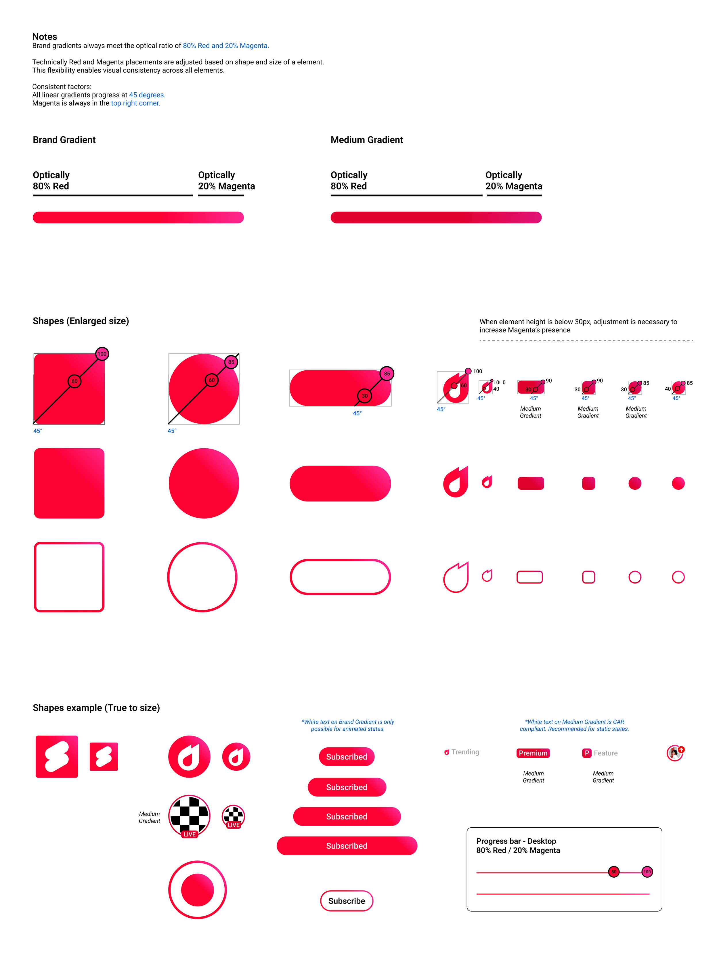
The specs for the new color application within UI shapes


